Páginas filhas
  • Standardization of products in PO UI (BackOffice)

01. OVERVIEW

This document aims to set development patterns for the Protheus BackOffice line products that use PO UI components to create a single-use experience for the users so that they do not have to adapt to each new screen created.

02. DEFINITIONS


Browse

All captions or statuses used in a Browse must follow the guidelines below:

  • Alignment to the left of the table;
  • Preferably use the "labels" format;
  • Avoid long captions/statuses
    • Use a tooltip to detail the status if needed.
  • Fixed label size considering the longest text.


The columns of a browse must follow the same format and name as Protheus.

  • Use field titles from the SX3 dictionary
  • Order using field list from SX3


It has been set that, for the Advanced Filter option, the slide pattern must be used as proposed below:


For the behavior of the Browse filter in PO UI, it has been set that it must occur automatically, i.e., when the user does not enter anything into the search field for an interval over 3 seconds, a new search must be performed to the Back-End automatically. This search is interrupted if the user continues typing and is performed again if a new interval without typing occurs. Below is an example of the automatic search behavior, without the need to enter the entire code and trigger the search button:


  • The buttons of a browser that set the initial actions are positioned to the left, followed by a filter with the advanced search option.


  • A Browser that does not have buttons in its initial definitions, but has the search and advanced search options, is aligned with the title.
  • The buttons positioned in the footer must be aligned to the right, and, in the case there are many options, use a dropdown with related actions, but do not put all screen actions in a single dropdown, otherwise, the screen's dynamism is lost. 


References:


When a color must be defined manually using a component, card, or chart, the default PO UI colors must be the priority.


For routines with a greater need for colors or tone variations, you may use the colors standardized in the GetColorChart method of the CoreDash class according to the class details. If a greater number of colors is needed, this must be previously agreed upon, and the new colors must be added to the color chart below for use in the entire BackOffice.


Grey Shades

Color

Hexadecimal Code

RGBA Code

PO-UI Code

Dashboard ID

#c8c8d2

200, 200, 210, 1

-

12

#c0c0c0

192, 192, 192, 1

-

11

#708090

112, 128, 144, 1

-

27


Blue Shades

Color

Hexadecimal Code

RGBA Code

PO-UI Code

Dashboard ID

#32a5ff50, 165, 255, 1-

10

#0078ff0, 120, 255, 1-

9

#0c9abe12, 154, 190, 1color-01-

#2c85c8

44, 133, 200, 1

color-02-

#2c43c844,  67, 200, 1color-03-

#5843c888,  67, 200, 1color-04-

#0000cd0, 0, 205, 1-20

#19197025, 25, 112, 1-19


Green Shades


Color

Hexadecimal Code

RGBA Code

PO-UI Code

Dashboard ID

#abc249171, 194, 73, 1color-09-

#56b96b86, 185, 107, 1color-10-

#00b28e0, 178, 142, 1color-111

#06a6a56, 166, 165, 1color-12-

#00c9a10, 201, 161, 1-2

#adff2f173, 255, 47, 1-23

#228b2234, 139, 34, 1-22

#0064000, 100, 0, 1-21

Brown Shades

Color

Hexadecimal Code

RGBA Code

PO-UI Code

Dashboard ID

#a05028160, 80, 40, 1-16

#800000128, 0, 0, 1-15

Purple Shades

Color

Hexadecimal Code

RGBA Code

PO-UI Code

Dashboard ID

#ab43c8171, 67, 200, 1color-05-

#ab4391171, 67, 145, 1color-06-

#b923b9185, 35, 185, 1-14

#800080128, 0, 128, 1-13

Pink Shades

Color

Hexadecimal Code

RGBA Code

PO-UI Code

Dashboard ID

#ff78ff255, 120, 255, 1-18

#ff00ff255, 0, 255, 1-17

Red Shades

Color

Hexadecimal Code

RGBA Code

PO-UI Code

Dashboard ID

#fa8072250, 128, 114, 1-24

#c64840198, 72, 64, 1color-073

#e34940227, 73, 64, 1-4

Orange Shades

Color

Hexadecimal Code

RGBA Code

PO-UI Code

Dashboard ID

#ffa236255, 162, 54, 1-8

#ea9b3e234, 155, 62, 1color-087

Yellow Shades

Color

Hexadecimal Code

RGBA Code

PO-UI Code

Dashboard ID

#fccb4c252, 203, 76, 1-5

#ffd464255, 212, 100, 1-6

Pastel Shades

Color

 Hexadecimal Code

RGBA Code

PO-UI Code

Dashboard ID

#d2b48c210, 180, 140, 1-25

#f5deb3245, 222, 179, 1-26

#ffe4e1255, 228, 225, 1-28

Although each project has its particularities, we reserve some caption colors that should be used whenever it is necessary to represent the status assigned to it. Other statuses that were not defined in this standardization will have their colors assigned by the product individually, considering their needs.

The statuses defined are:

  • "Disabled" and "Finished"  - Red (color-10)
  • "Enabled" and "Open"     - Green (color-07)
ColorHexadecimal CodeRGBA CodeColor Example
color-07#c64840rgba( 198, 72,  64, 1)

color-10#56b96brgba( 86, 185, 107, 1)

It has been set in a meeting that screens containing the row action column must position it to the left, as in the example:


Data Display

LGPD - Field Overshadowing

It has been set that the field overshadowing pattern for LGPD will be the display of a TAG with the RESTRICTED word.

Component: po-tag, color-07, p-inverse=true

Example of use:

Login using Protheus:


The language presented in the routines must be the same one selected in the login made on SmartClient according to the image below:


Login using Mingle:


When using the PO UI routines through the browser using the Mingle login, the language selected at the login time must also be displayed, even if the browser language is different:


NOTE: The pre-selected language on Mingle's Login screen must be following the language set on the browser if an equivalent translated language exists. If no translation for the browser language exists, the default language must be Portuguese, but if it is manually changed, the language selected by the User will be used.


The display of numeric and/or monetary fields must follow the same standard used in Protheus ERP applications, that is, following the definitions used in the configuration of the respective environments using the PICTFORMAT key. When it is set to DEFAULT, the display format must be ',' (comma) as a decimal separator and '.' (dot) as a thousand separator. When set to AMERICAN, the display format must be '.' (dot) as decimal separator and ',' (comma) as thousands separator, even if, in the data dictionary of the corresponding field, picture (X3_PICTURE) is set to '@E'.


NOTE: To check the content of the AppServer keys within the APIs, use the function GetSrvProfString.


Branch Swap/Selection

This solution must only be used on external applications; applications embedded in Protheus must use the default company and branch.


  • When accessing the application, the company and branch registered as default in TOTVS Mingle must be used.
  • Selection or Change of Branches must occur only after the user logs in to the application;
  • The Branch Swap option should be a toolbar option and follow the model below:


New version of .app

Purpose: On this page, register the official documentation and some tips for implementing the pipeline-poui.

CI/CD Pipelines

The purpose of a pipeline is to automate the process of delivering software in production quickly while ensuring its stability, quality, and resilience.


Complete DevOps team documentation on pipeline-poui

https://code.engpro.totvs.com.br/engpro-devops/pipeline-poui


Shipment of .app

  • Shipping the .app file: THF Shipment(.APP)
  • Shipment of .app file by the Compilation Spool: Process of sending THF(.App) files using the compilation Spool

Example of generating a new stable version in gitea

Positioned in your remote repository, in the branch where your new version will be based, execute the following commands (use the git terminal of your choice):


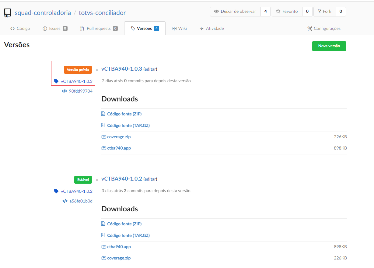
Accessing the repository in gitea, in the Versions tab, we will have a new tag with the previous version status:

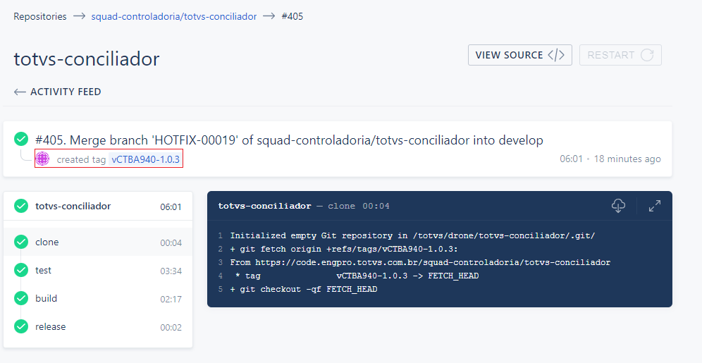
Before changing the version to the stable status, it is important to check if all the drone steps have been successfully executed:

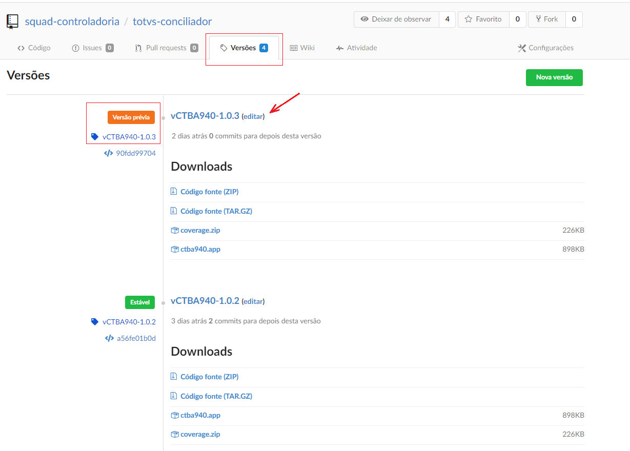
To change the status of the version to Stable, just click edit in the version title:


On the screen that appears, deselect the "Mark as Pre-Release” option:
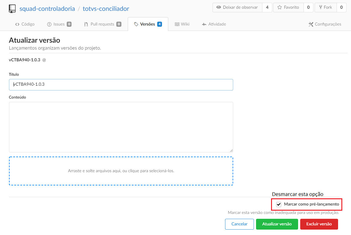


After this last step, the version will be in Stable status and ready to be compiled in D-1 if your webhook (see documentation) is already configured:

API Documentation

The standard for API documentation is OpenAPI v3.

To speed up documentation, we have the engineering tool with a graphical interface on the link:  OpenAPI-GUI v3

Another tool is the OpenAPI extension of VSCode. In it, we can write the yml file and view it using the Swagger UI.

Definition...

Example:


Check below the documentation FAQs for BackOffice Products developed in PO UI with a general target audience, that is, intended for Developers, Technical Support, and also for Customers:


FAQ - Dashboard BackOffice


FAQ - Sales Management Portal


FAQ - Track Costs (Note: at the end of the page)


Below is the link to access the documentation of a FAQ for the Technical Support team to support Customer tickets:


PO UI - Support Document

Next Topic

Definition...

Example:


03. APIs DEVELOPED